Free the Map
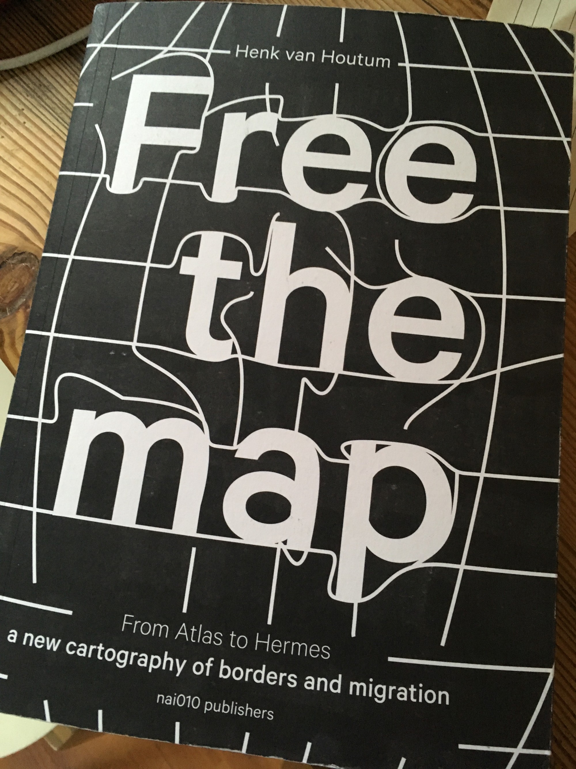
Map attack! In Free the Map, a new publication by Henk van Houtum, traditional maps are challenged and new cartographic stories and representations are discussed and encouraged. A must for our readership.
Map attack! In Free the Map, a new publication by Henk van Houtum, traditional maps are challenged and new cartographic stories and representations are discussed and encouraged. A must for our readership.

Not very relevant for a review, but this book has a great smell of new books as well.
As a lover of maps and atlases, I was looking forward to reading Free the Map, the new book by Henk van Houtum, by nai010 publishers. However, I was not expecting so many mind-benders. It does a great job of challenging the way standard atlases and maps depict our world, and is a must for our readership. It’s a plea to get rid of standard maps, as they limit our understanding of the world and reify a narrowed-down worldview.
Let’s take a few steps back. With the ubiquitousness and omnipresence of maps, it’s easy to overlook that all maps are a story, not a reality. Van Houtum uses the example of Magritte’s painting, “Ceci n’est pas une pipe” to illustrate this point. The painting reminds the viewer that although a depiction of a pipe might look like a pipe, it’s in fact NOT a pipe itself, and this is also the case with maps. It’s not THE world you are looking at when you are gazing at a map, but a depiction of it. Something you should keep in mind with any map you get your hands across. A map is a story, if you will; choices have been made, details have been left out, and borders have been accentuated to make the map clearer, legible and to get a message across. But this story can get in the way of our understanding of the world.
Henk van Houtums target is first and foremost the standard atlas, for several reasons. The Mercator-projection, invented in the 16th century, is just one way to transfer the world as perceived as a globe onto a flare plan, and in Van Houtums mind, it should be retired. Most world maps we see around us, from IKEA posters to Google Maps are based on the 1569 map by Flemish cartographer Gerardus Mercator, latinised from Kramer. To get a sphere onto a flat piece of paper, you need a form of projection. Mercator used a projection based on meridians to turn the round globe into a flat map, with the north at the top and Europe at the center of the map.
One side effect implicit of this kind of projection is that territories on the northern hemisphere are depicted with a distortion: on maps with Mercator’s projection the Greenland looks as big as Africa, although its actual size is like the Democratic Republic of Congo. Check it out for yourself at this very cool website. Another good explanation about the different projections can be found here
Moreover, as Van Houtum points out in Free the Map, Mercator’s world map is colonial in nature, as it was meant to enable navigation from Europe to new areas, to be discovered, or more accurately, to be conquered. To put Europe in the center is a manifestation of power, as Van Houtum writes, and its predominance has for too long contributed to skewed proportions between the northern and southern hemisphere. Mercator’s projection served its purpose in a time and age of eurocentrism and colonization, but to continue using it would not do justice to the geographical realities of our sphere.

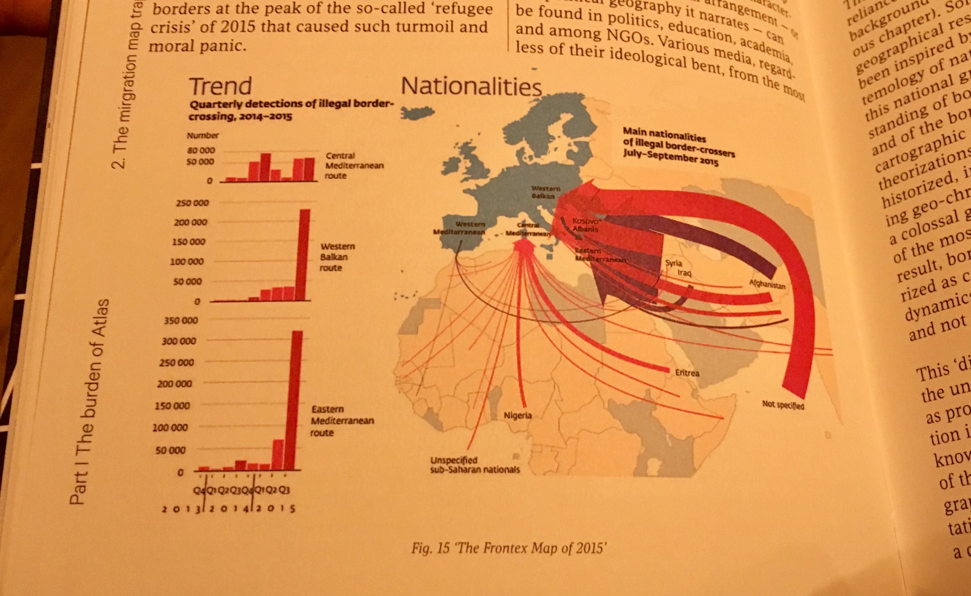
‘The Frontex Map of 2015’, as seen in the book, to illustrate the alarmingly red arrows that are used to depict migration.
From the bookAnother undesirable feature of many world maps, according to Van Houtum, is the division of the earth’s land mass into nation states. Everyone who has crossed a border, will know that the divisions between countries are almost never as clear cut as they are depicted on maps. The landscape often looks the same, the people in general look the same, and although the architecture might suggest some slight differences close to the border you can probably still get by in the language of the country you have just left. But maps that include borders and are organized around nation-state maps depict a world into which people are uniformly packed into national containers.
Furthermore, migration in these nationalist depictions is often represented as invasive and threatening by aggressive red arrows. A good example is the ‘migration map’ from 2015, by Frontex, the organization that deals with EU’s border politics. If you would depict the number of tourists visiting France each year, as Van Houtum writes, the red arrows would look surreal, but yet for migration, we keep using them. They are not only questionable in a political context, but arrows also never do justice to the movements of migrants, as the book amply demonstrates.

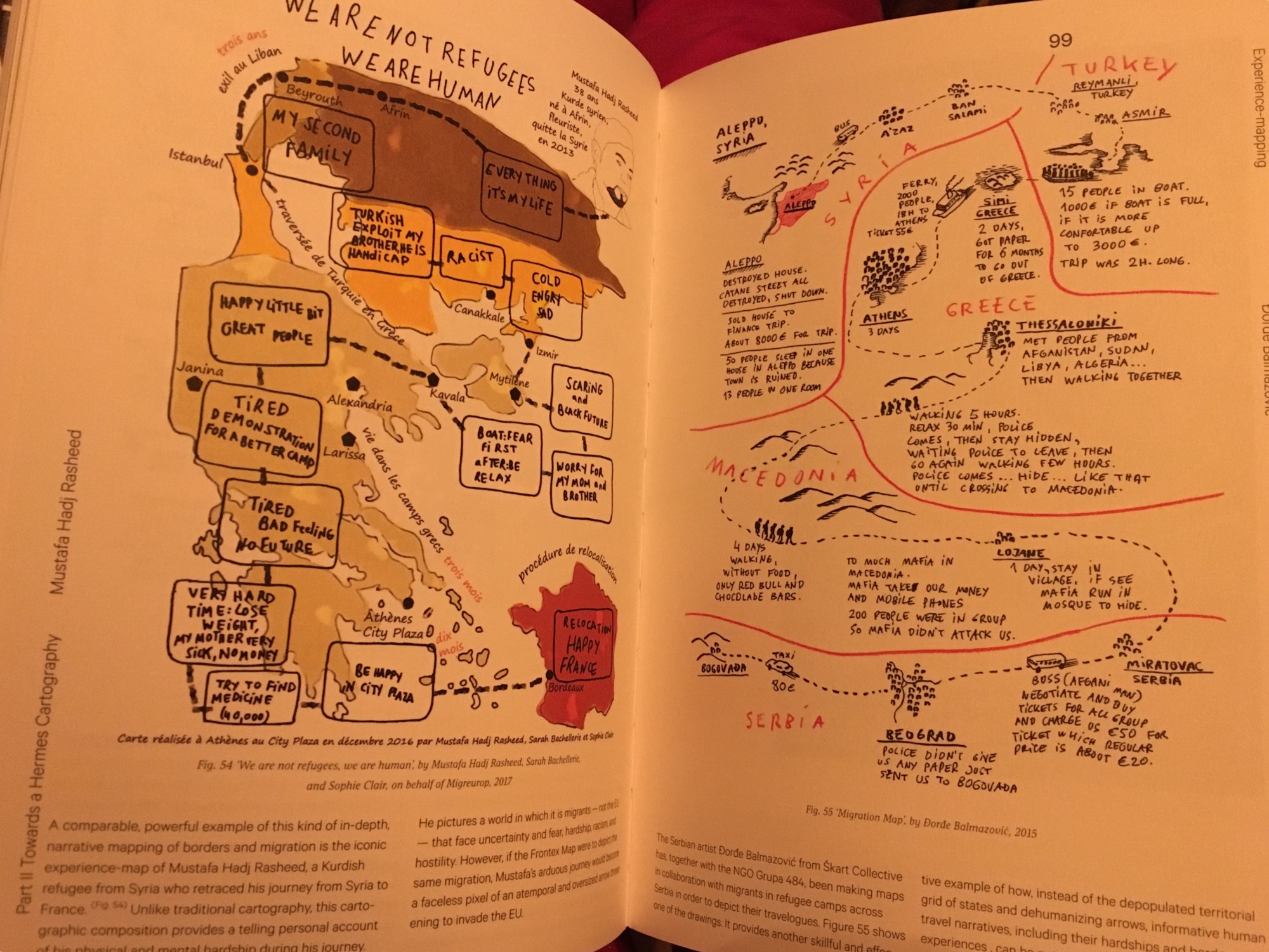
Another limitation of depicting migration with straightforward arrows, is that is doesn’t do justice to the winding routes a migrant experiences.
From the book.Free the Map is an invite to tell different cartographic stories and to depose Atlas, the God after whom atlases are named. Instead of continuing to use Atlas, the God who carries the world on his shoulders, Van Houtum pleads to relieve him of this burden and let his grandson, Hermes, take over. Hermes is the God of mobility and human connections. He is always on the move, carrying messages and not getting stuck in his ways.
The book is devoted to other ways of depicting the world we live in, highlighting that movement and changes are a natural, integral and inevitable part of living on earth. A wide array of alternative cartographic representations are presented by a number of contributors, opening up new ways in which we can make sense of the world we live in, and better do justice to human behaviors and stories. The book raises a number of interesting questions that remain unanswered, but invite the reader to bend their mind and think outside of the existing boxes and lines. Like: how can we create a map that is universally understood? And how can we depict migration without the use of aggressive arrows? How do you map stateless worldings? But also, on a personal level: what would a map that would include places you’d rather forget look like? Fantastic food for thought which lingers on much longer after you finish the book.
The book made me think of two couchsurfers from Mexico that I met when I was living in Berlin. We spoke on the phone before they visited my place, because they needed some directions. As they had decided not to use any existing maps to find their way around Berlin, they needed some pointers. They were creating their own map of Berlin, by only drawing what they had seen for themselves. So they drew a map to my house, marking also the good ice cream options and beautiful trees along the way. I thought this was and is a beautiful way of traveling and perceiving the world, mapping it for yourself and thus creating new realities.
This book Free the Map is a call to action, one in which you can join, it offers interesting best practices provided by a wide variety of artists and geographers, and includes ready-to-use challenges that can be taken into workshops and meetings. These are also accessible online.

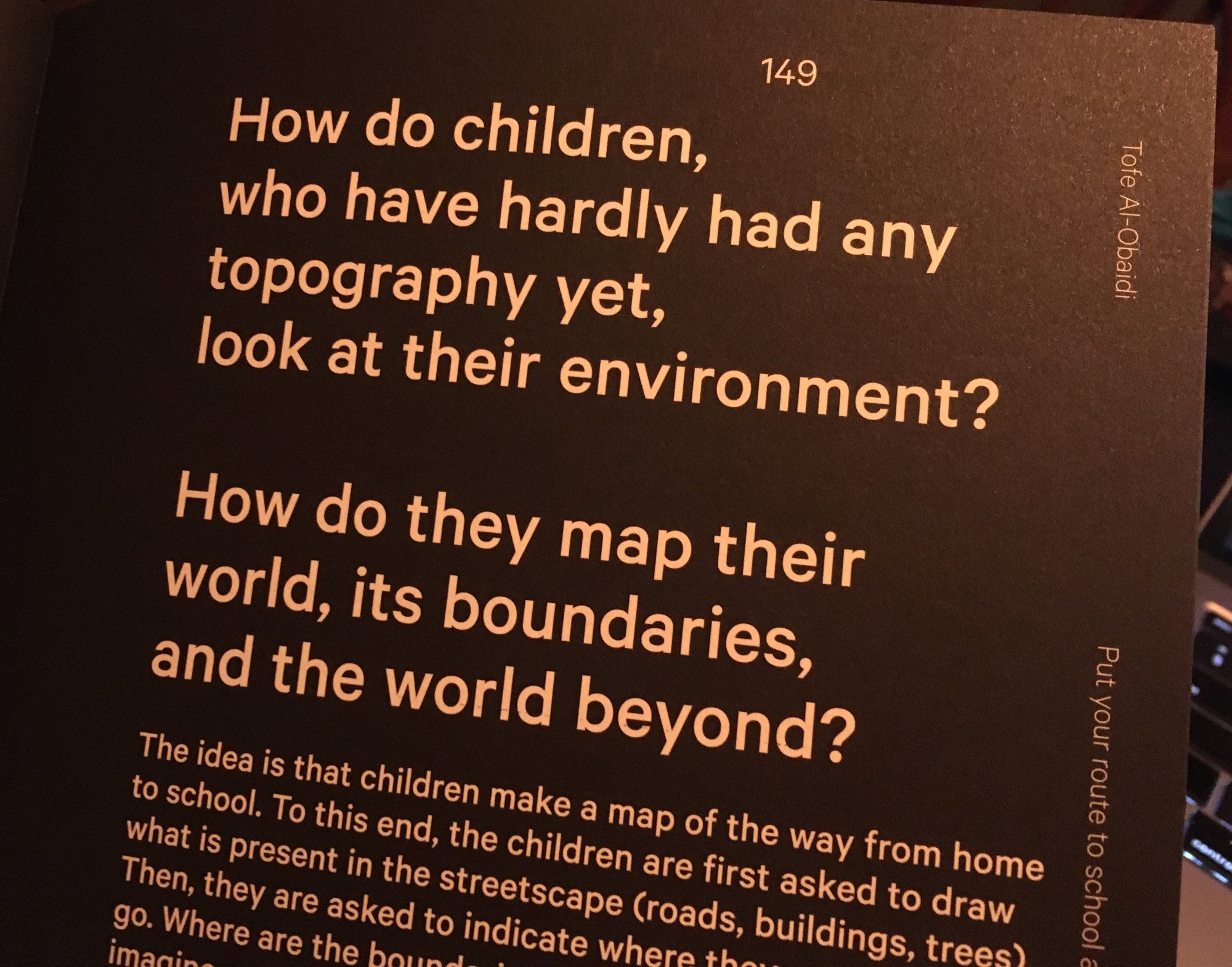
The book contains also great ideas for mapping workshops with children, by Tofe Al-Obadi, one of the contributors.
From the book.Let’s keep loving Atlas and atlases, but let’s also be aware that a lot of them are arguable dated and limit our view of the world. As this book expertly demonstrates, there are many more new and exciting ways to represent our lives and stories on this round floating globe we live on.
Henk van Houtum (2024), From Atlas to Hermes: a New Cartography of Borders and Migration, nai010 publishers, Rotterdam (2024). Book design by De Vormforensen and contributions by a.o. Rodrigo Bueno Lacy, Tofe Al-Obaidi, Catalogtree, Yishay Garbasz, Susanne Khalil Yusef, Nicolas Lambert, Sarah Mekdjian, Ruben Pater, Philippe Rekacewicz, Malkit Shoshan, Jonas Staal, Irene Stracuzzi, Annelys de Vet, Jasmijn Visser, Denis Wood.
Many thanks to our explorer Jonathan Casewell for editing.